Design Inspiration: 8 map styles you should know about
In our efforts to create a map of Riyadh (KSA) for the relocation of Lati boutique from its original place in Kingdom Center to Imam Saud road, we have encountered many interesting styles and types of map designs through our research. Since links showcasing inspirational maps are abundant on the web, we have decided to save you time and present you with this list of maps classified by style for your inspiration. Here are the 8 categories we have encountered and that has impressed us the most:
1. Schematic
Schematic maps are widely used. We encounter them almost on daily basis. They are everywhere! Especially on the streets. Perhaps the most iconic ones are Harry Beck's London Tube map in 1933 and Massimo Vignelli's map of New York Subway in 1972. Schematic maps are meant to communicate visually with the viewer and help him fulfill a journey or understand a flow by omitting irrelevant elements and emphasizing the elements of focus.
New York Subway Map 1973 - Massimo Vignelli (Source: Analogue 76)
London Tube Map 1933 - Harry Beck (Source: Wikipedia)
2. Typographic
Typographic Posters are challenging. Wether you employ multiple fonts or 1 typeface, design elements are restricted to typography to depict the geographical spaces. Again, New York and London are at the top of the list of most creative typographic maps.
Unknown Artist (Source: Cargo Collective)
New York - Benoi Cesari (Source: Digital Arts Online)
3. Interactive
This is when it gets tricky. When it comes to interactive maps, not only you should design the layout and the interactive experience, but you should also ensure a perfect balance between aesthetics and usability even with abundance of information or advanced levels of interaction. For interactive maps, check out these two peculiar examples:
A. NORSE
"Norse" maps cyber attacks happening around the world LIVE... It makes you feel at the heart of World War III. It is truly mind-blowing.
http://map.norsecorp.com/
Screenshot - NORSE (Norse Website)
B. Build with Chrome
"Build with Chrome" is a microsite made by Google in collaboration with Lego that enables lego enthusiasts to build structures and publish them on the world's map. It is a true platform for self-expression. Try it out: https://www.buildwithchrome.com/
Blue Hat's Build - Screenshot - BUILD WITH CHROME
4. Realistic
Static or Interactive, realistic maps are representations of actual areas where shapes such as land, sea, and roads are depicted while staying true to scale. Other than facilitating our lives with transportation routes and helping us reach our destinations, Google Maps gives you the ability to customize its maps on your website with your own color palette. Check out this third party tool for customization: snazzymaps.com.
Beirut, Lebanon (Source: Google Maps)
Boston Map (Source: The University of Texas At Austin)
5. Infographic
Owing to the rise of Social Media, every person can now create, share and publish content quite easily. As a result, we are now living in an extremely cluttered (digital) world. To cut through clutter, the trend of infographic content has emerged. The purpose of infographics, as the name suggests, is to deliver complex information or statistics through a simple, straight to the point, and visually appealing graphics. Interestingly, this trend has also affected B2B (Business to Business) companies who now enrich their piles of reports with infographics to help readers understand information in an easy and straight-forward way.
Los Angeles - Owen Gatley (Source: Digital Arts Online)
Women in the boardroom - Grant Thornton (Source: Grant Thornton)
6. Hand-drawn
Hand-drawn maps celebrate talent and creativity. The following pictures speak for themselves.
Livi Gosling - (Source: Digital Arts Online)
London - Jenni Sparks (Source: jennisparks.com)
7. Retro / Vintage
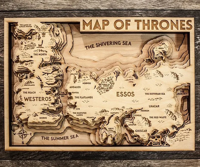
Retro / Vintage maps can vary a lot in style, but they almost always have one thing in common: Old typefaces (Serifs more than San Serifs), beige backgrounds, hand-drawn ornaments, borders and frames, italic fonts, high contrast, and other. Even in 2015, retro and vintage maps can be cool especially when depicting trending TV shows such as Game of Thrones.
Europe - Cavallini & Co (Source: Stampington)
Game Of Thrones - Pikselmatic (Source: Pinterest)
Game Of Thrones 3D wood map (Source: This is why I'm Broke)
Nairn Transport Company 1923 (Source: Fuchs Online)
8. Illustrated
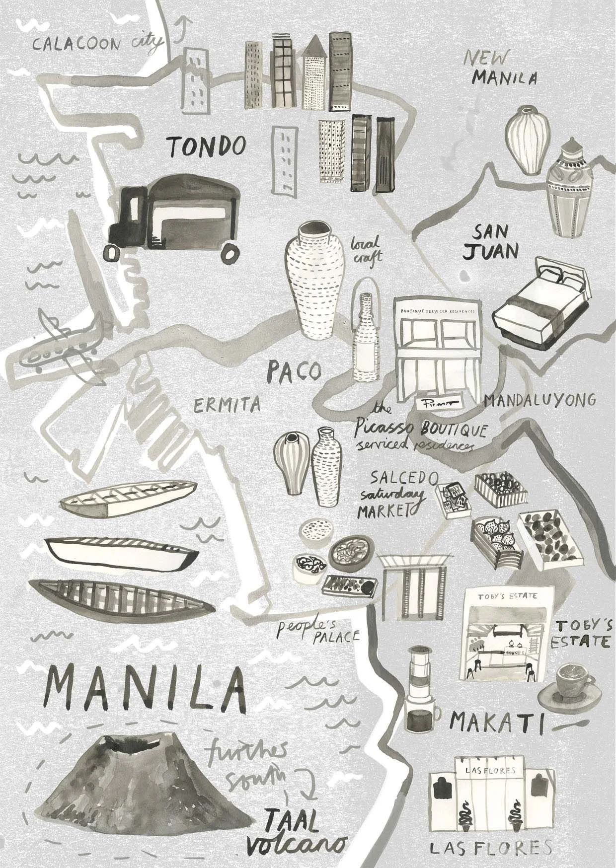
Whenever we are in London and we step into the piccadilly line, we always enjoy looking at the illustrated map by LULU PINNEY that highlights major landmarks in London. In their own way, Illustrated maps tend to be schematic, they omit what is not needed and focus on necessary information only. Since the stress in this kind of maps is on the objects rather than the landscape, often slightly distorted or reduced. Such a map can thus sometimes appear as a caricature. However, despite scale distortions, this kind of maps is highly popular for being attractive, informative and easy to use.
Picadilly Line Map - Lulu Pinney (Source: Eye Magazine)
Romualdo Faura - (Source: Digital Arts Online)
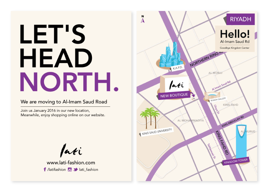
When created for brands, these maps follow their brand guidelines, fonts, colors etc...That is why we have decided to proceed in the illustrated format for the the map that we have created for Lati's flyer and which announces its move from its current location to its new one giving away all necessary details in an attractive format.
Lati Map - Designed by Blue Hat
Lati Map, Arabic Adaptation - Designed by Blue Hat


