The Psychology of Colors
Does sitting in a fast food restaurant make you feel uncomfortable? Feeling relaxed and sleepy at the office? Well, it may all come down to colors. Colors that we are exposed to daily can have a great effect on the way we feel. Each color has a different connotation, hence, brands use it to appeal to our emotions.
Blue
Blue has a relaxing effect on the human eye. It is used to comfort us and give us a sense of security.
Brands that use blue: Facebook/ Twitter
source: www.imagekb.com
source: retaildesignblog.net
Red
Red is scientifically proven to increase our blood pressure and heart rate. Sitting in a room surrounded by red causes an increase in energy. This is why most fast food chains use red in their restaurants to make the customer feel uneasy in order to allow a fast flow of customers (hence the name “fast food”).
Brands that use red: Pizza Hut/ KFC
source: wishurhere.wordpress.com
Orange
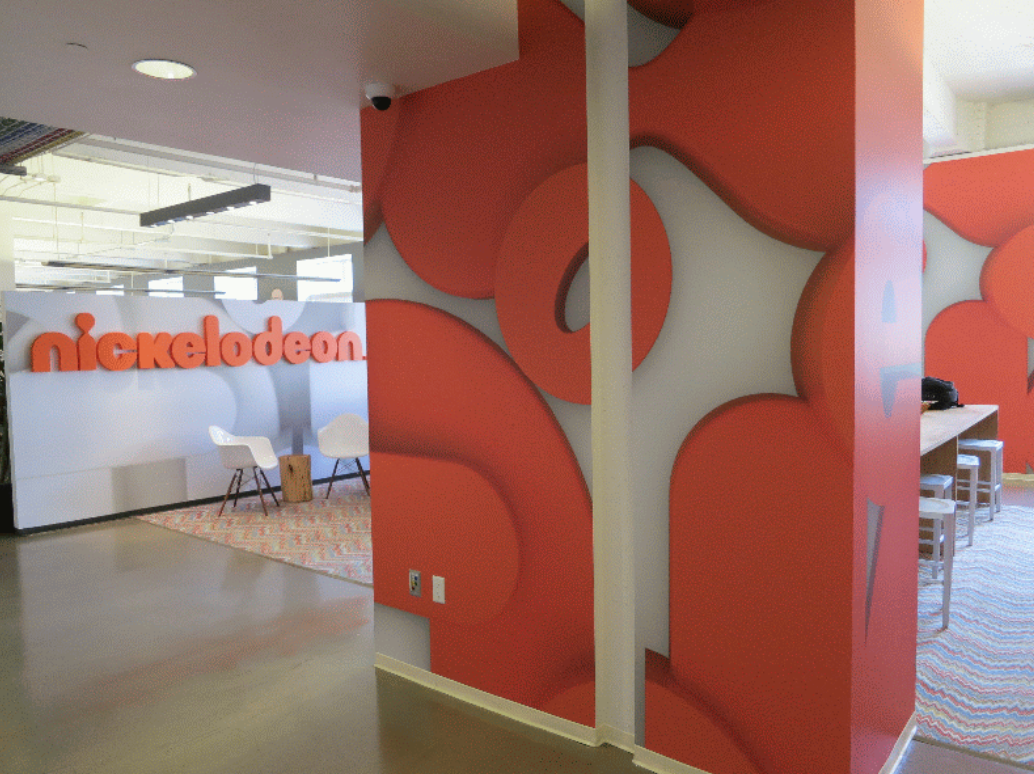
Orange is a vibrant color associated with energy. It is used to display a fun and lively atmosphere.
Brands that use orange: Nickelodeon/ Fanta
source: nickelodeon.wikia.com
source: www.iconographystudios.net
Yellow
Seeing yellow alerts the viewer and draws attention. That is why it is used heavily in road signs. It is also a cheerful color, often associated with happiness, which explains why the “smiley face” emoticon is in color yellow.
Brands that use yellow: Subway/ McDonalds
source: commons.wikimedia.org
Green
Green is used mostly in spas and hospitals since it conveys a sense of healing and peace. It is also associated with ecology and is used mostly by brands that want to display, or be labeled as, organic and eco-friendly products/entities.
Brands that use green: Land Rover/ Vicks
source: www.irononsticker.com
Purple
Purple is the color of royalty and spirituality. Using purple gives a sense of supremacy, and importance.
Brands that use purple: Hallmark/ Cadbury
source: cvilleshop.com
Black
Although black is associated with sadness, mourning and depression, it is also recognised as a classy and timeless color. Black is definitely the color of sophistication, which is why it is used by most luxury brands.
Brands that use black: Chanel/ Elie Saab
source: blogs.uoregon.edu
source: www.oracleinteriors.co.uk
Gray
Gray is a neutral color that can go well with anything. It is scientifically proven to enhance creativity, which is why most offices choose gray for their walls or tables.
Brands that use gray: Apple/ DELL
source: www.brandprofiles.com
source: retaildesignblog.net
Brown
Brown is a trustworthy color and most brands use it to show credibility and display their history and heritage.
Brands that use brown: UPS/ Louis Vuitton
source: pursuitist.com
source: wheels.blogs.nytimes.com
White
White is a calm color that is associated with cleanliness and purity.
Brands that use white: Dove/ Kleenex
source: mktwithoutborders.wordpress.com
In short, we are surrounded by colors and it is no surprise that brands use colours to their advantage.
I bet the next time you see a brand logo, you will be thinking twice about the message this brand is trying to portray!
source: www.paulaschoice.com


