WTN
Designing for Hope: WTN’s Journey to Empower Recovery
Project Type
Brand Identity / Strategy / Graphic Design
Location
Riyadh, Saudi Arabia
Industry
Non-Profit
Challenge
Every year, a significant number of individuals in Saudi Arabia seek addiction treatment abroad due to limited local options, representing a missed opportunity for comprehensive care. WTN fills this gap as one of the Kingdom’s leading accredited, purpose-driven rehab centers, offering unique features like horse therapy, art therapy, and gender-specific campuses aligned with Vision 2030. Blue Hat was commissioned to craft WTN’s brand identity and internal branding of the facility, emphasizing safety, belonging, and recovery. Through thoughtful design, we showcased WTN’s holistic approach, positioning it as a beacon of hope for individuals reclaiming their lives locally.

Intervention
.Blue Hat was commissioned to create a graphic identity and internal branding of the center that embodied WTN’s values, purpose and holistic protocol:
● Brand Rationale:
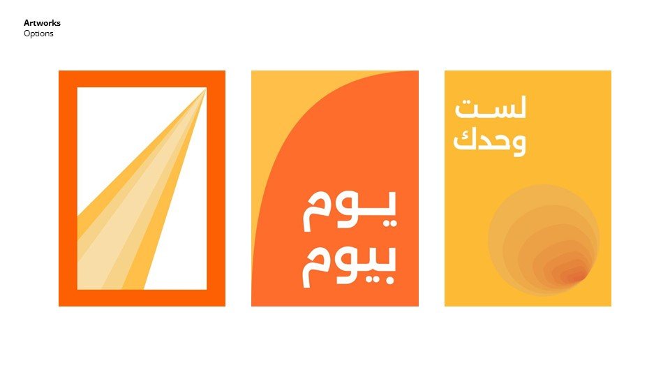
○ Developed “The Healing Cycle” emblem to represent the non-linear process of recovery, emphasizing that individuals are always welcome back at any stage of their journey. The circular design symbolizes continuity, inclusivity, and the transformative nature of healing.
○ Crafted a color palette transitioning from deep lavender to lighter shades, representing the journey from pain to renewal, with yellow highlights symbolizing optimism and hope.


● Facility Branding:
○ Designed internal branding for a welcoming, judgment-free environment that fosters safety, optimism, and a sense of belonging.
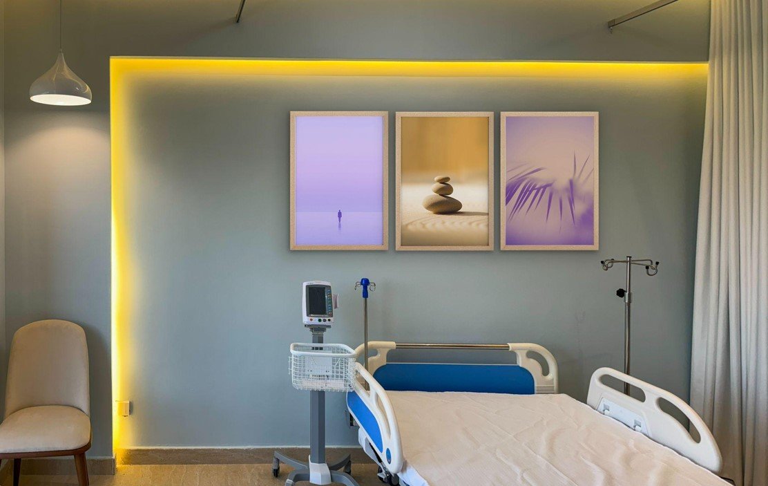
○ Integrated graphic elements throughout the facility, from the welcoming area to communal spaces such as pools, padel courts, gardens, and cafés, ensuring alignment with the center’s mission of holistic care. The design extended to therapy rooms and even the beneficiaries' private bedrooms within the villas, creating a cohesive and supportive environment.
● Visual Identity:
○ Created a modern and empathetic visual language, harmonizing WTN’s advanced treatments, such as horse and art therapy, with its nurturing atmosphere.
○ Tailored the design for inclusivity across different campuses for men and women, ensuring alignment with the facility’s personalized care approach, such as 1 nurse for every 4 villas.


Results
Humanized Identity: The circular emblem and calming lavender gradients reinforced WTN’s message of hope, healing, and belonging, resonating with clients and their families.
● Enhanced Experience: Internal branding fostered a therapeutic environment, seamlessly connecting WTN’s state-of-the-art facilities with its mission to empower recovery.
● Increased Awareness: WTN’s refreshed identity positioned it as a beacon of recovery in Riyadh, aligning with Saudi Arabia’s Vision 2030 goals for enhanced healthcare services.
WTN’s new identity not only reflects its unique approach to addiction recovery but also empowers individuals to take the first step toward creating a better version of themselves.

People Also Viewed


Blue Hat™ - All Rights Reserved.